TicWatch Pro Smartwatch Review
The TicWatch Pro is a showcase of many unique innovations, such as dual screen technology intended to squeeze out more than a working week's worth of battery life. It's an assertively designed timepiece that wants to be seen as a classical watch. When it comes to software features - it’s crammed. Buy on Amazon
Design
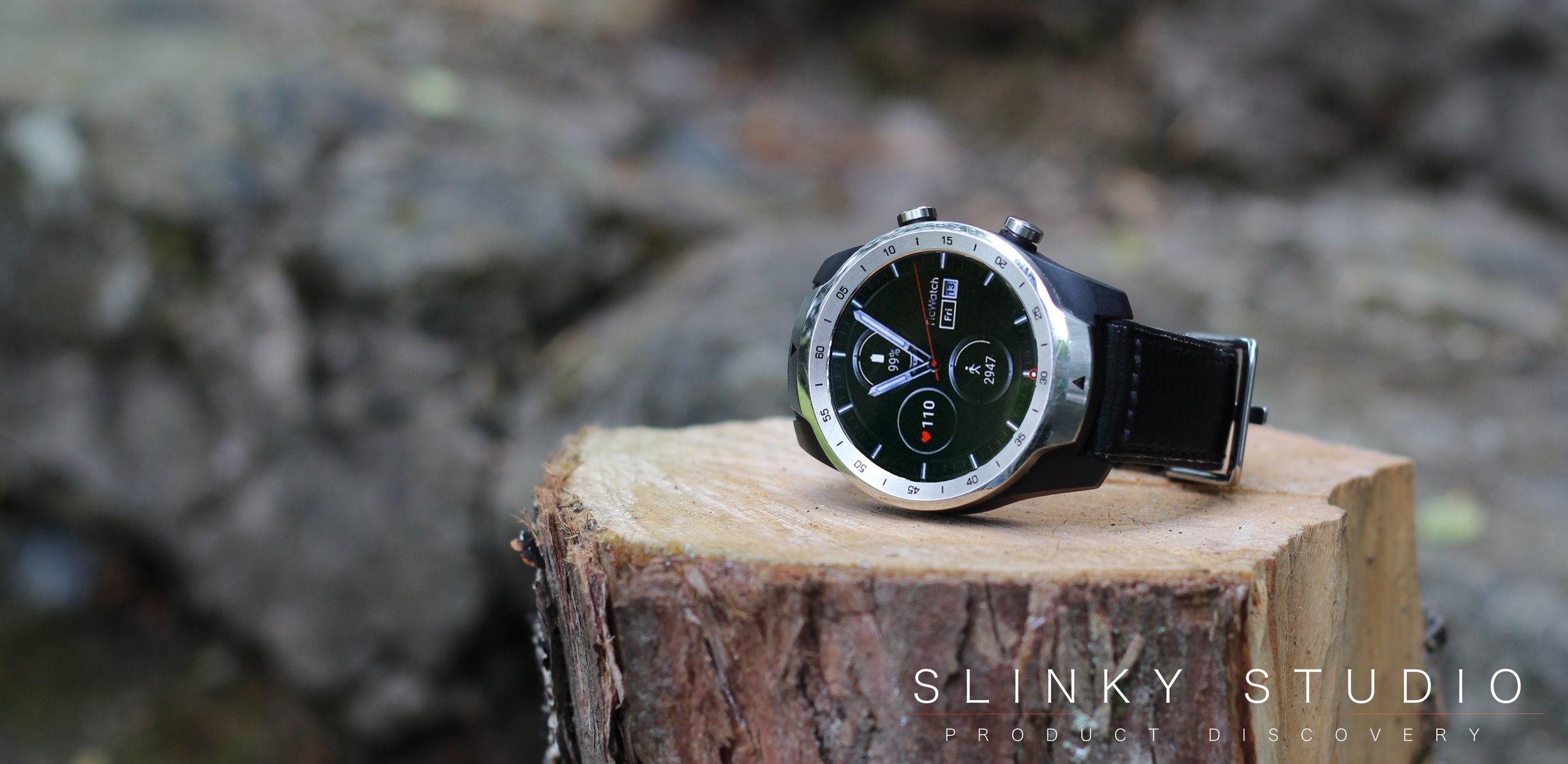
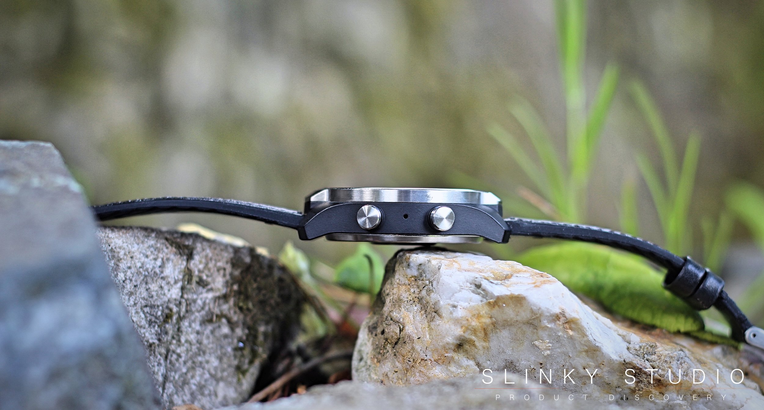
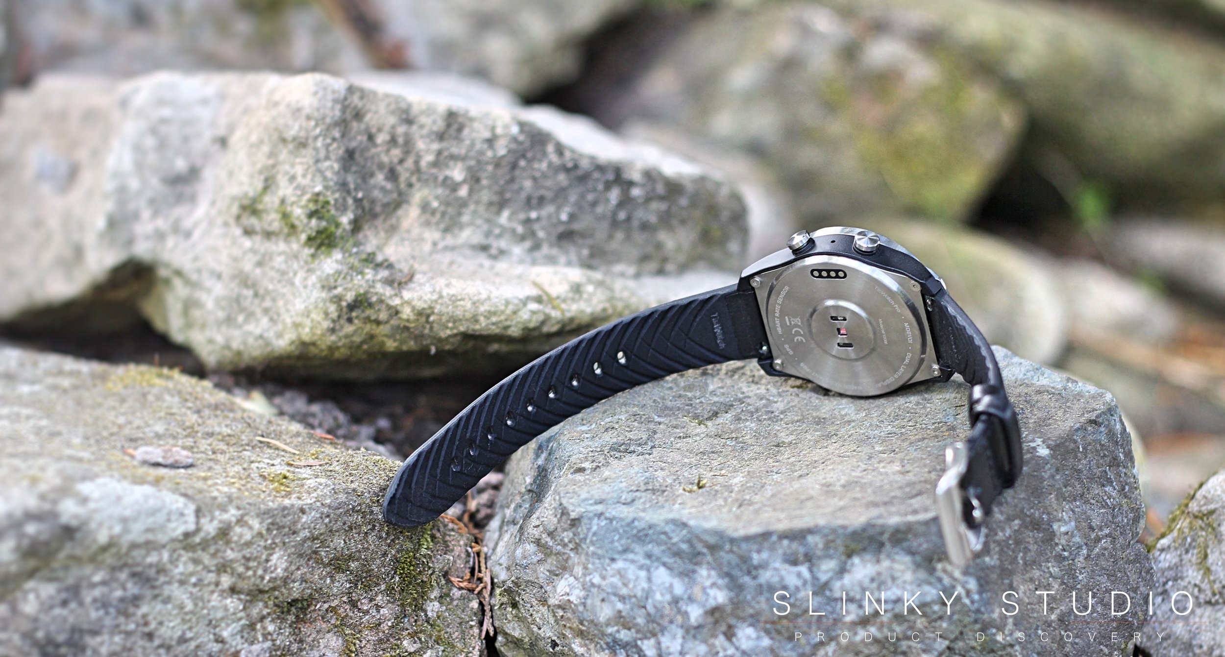
We’ve reviewed many watches, so we admit to being surprised that under all the technology is a timepiece that has an assured posture with its stainless steel casing, sharp lines and 12.6mm thickness. What’s more the body is carbon fibre reinforced nylon - so whilst it should be impact resistant, it is also a compelling, more upmarket timepiece. We’re personally fond of the contrasting above mentioned stylings; and when compared to the Apple Watch crowd of smart wearables, it definitely sits in a separate category for style. For some though, this modernist face within a more classical watch persona might not be quite the ticket.
The TicWatch Pro arrives with a curious watch band that from its exterior attributes wouldn’t lead you to guess when active it was comfortable and breathable. This is thanks to a hybrid use of Italian leather on the outside and silicone on the inside of the strap. A selection of other designs are available, but we’re satisfied with this one for now.
2 Displays = Better Battery Life
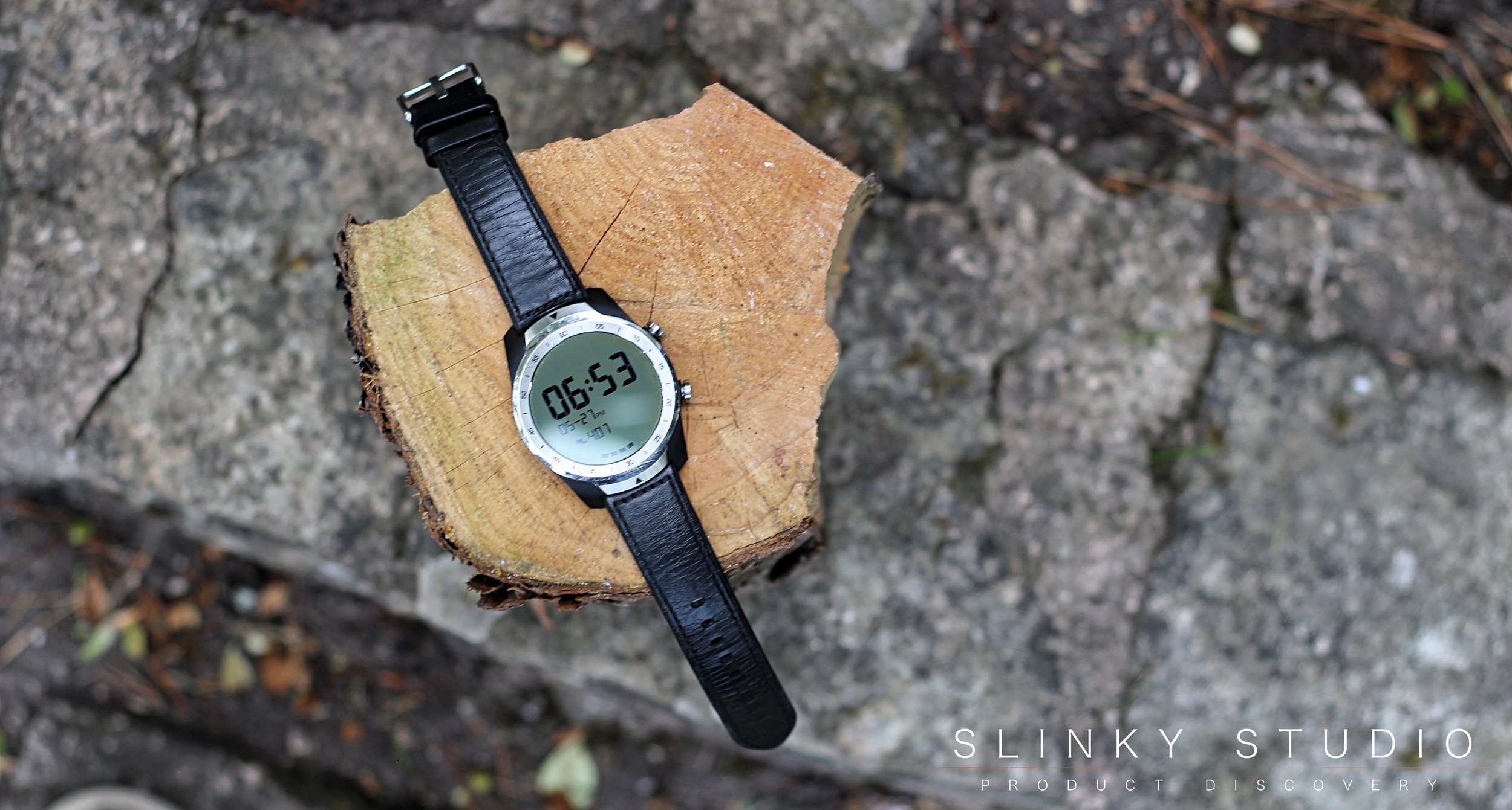
The sandwich of two separate displays is definitely one of the most interesting hardware inclusions within the TicWatch Pro and despite how closely we interrogate the design we can’t quite see how they’ve done it? On top is a low power consuming AMOLED display, which has more in common with a retro digital watch. Underneath this is an exquisite OLED display that resembles a high DPI printout and helpfully the legibility isn’t hurt in direct sunlight.
When the TicWatch isn’t being interacted with on our wrist, we have it configured in the way encouraged by the makers Mobvoi, to show a simplistic readout of time, steps, heart rate, etc., via the AMOLED display. This is referred to as ‘essential mode’ and also goes into exclusive action when the battery is depleted to such a level that it cannot continue in regular ‘smart mode’ where the OLED display is functional, allowing full access to all Google Wear features. This hybrid display technology claims to be able to last for up to a month in essential mode; and not having the opportunity to leave the TicWatch Pro dormant for such a length of time we cannot say whether this is accurate. However, with ‘smart mode’ preservation of energy enacted within the mix of our day to day regular usage patterns of around 30 minutes per day, the battery can sustain a decent 3-4 day stretch - not quite a working week though. Interestingly, with essential mode not enabled our TicWatch Pro’s battery struggled to get past a single day.
User Experience
We’ve been quite lucky in that our opportunity to review the TicWatch Pro has come about with a more mature Google Wear OS, that from our experience seemingly lacks many of the quirks and bugs that have troubled earlier adopters. To start with, syncing the watch with the Wear App from an iOS device was absolutely faultless and a notably quick process, although we’d imagine the larger demographic that will buy into this particular segment will be Android users. That’s not to say that the OS itself is entirely hiccup free; our biggest complaint would be the animation lag and stuttering within the UI. Whether hardware or software related, it’s unpleasant; so hopefully continual rollout of automatic updates will improve this.
Google Wear is the backbone on which the experience relies, and because there are plenty hardware features, it can make optimal use of the OS. Jumping around the functions is generally quite well thought through; a credit to Google. Of course, most of the interactions are touch based, but two physical crowns on the right hand side reside for quick access to the pre-installed App list and the bottom one for TicExercise (we’ll get onto this). Overall the experience offered from this first generation device is rather good. For instance the touch screen scrolling feels just about perfect. Tapping and swiping through the OS is recognised accurately, even with sloppy gestures. A surprise to us is that voice input via the Google Assistant would become one of our favourite and most used features. This can be credited to the inbuilt mic which has no issue understanding a normal speaking level. The way information is fed back through voice and visual methods is well thought through too; so asking for directions or attaining a quick answer to who is the 20th president of the USA becomes a practical ability directly from your wrist.
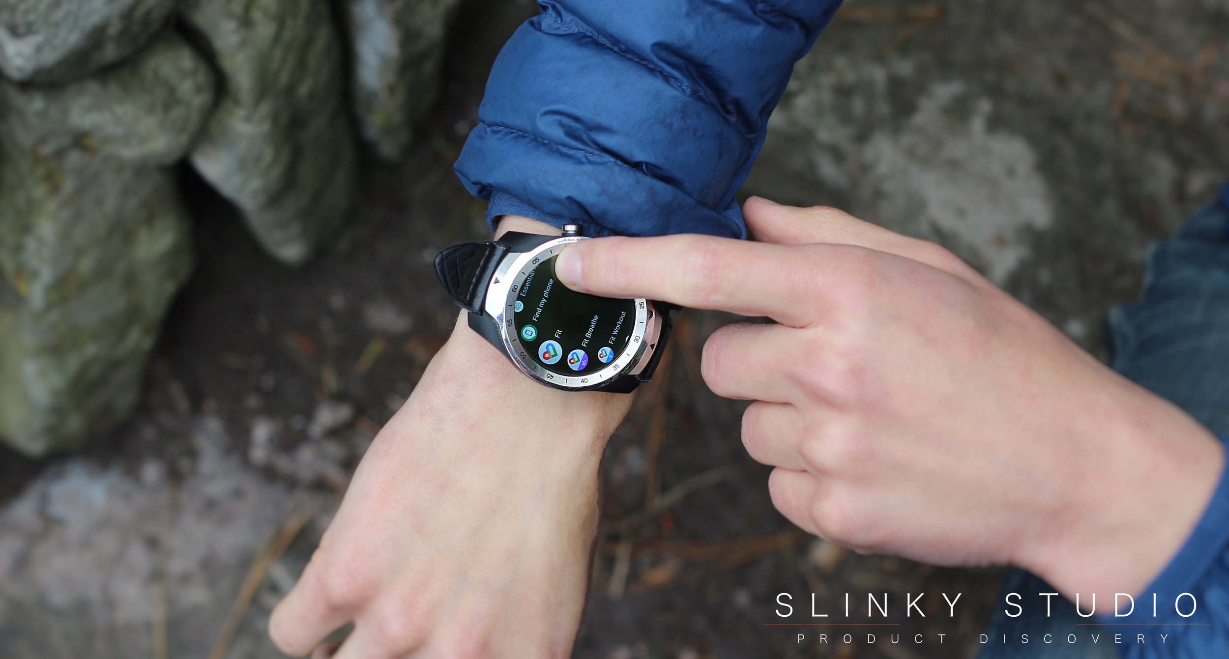
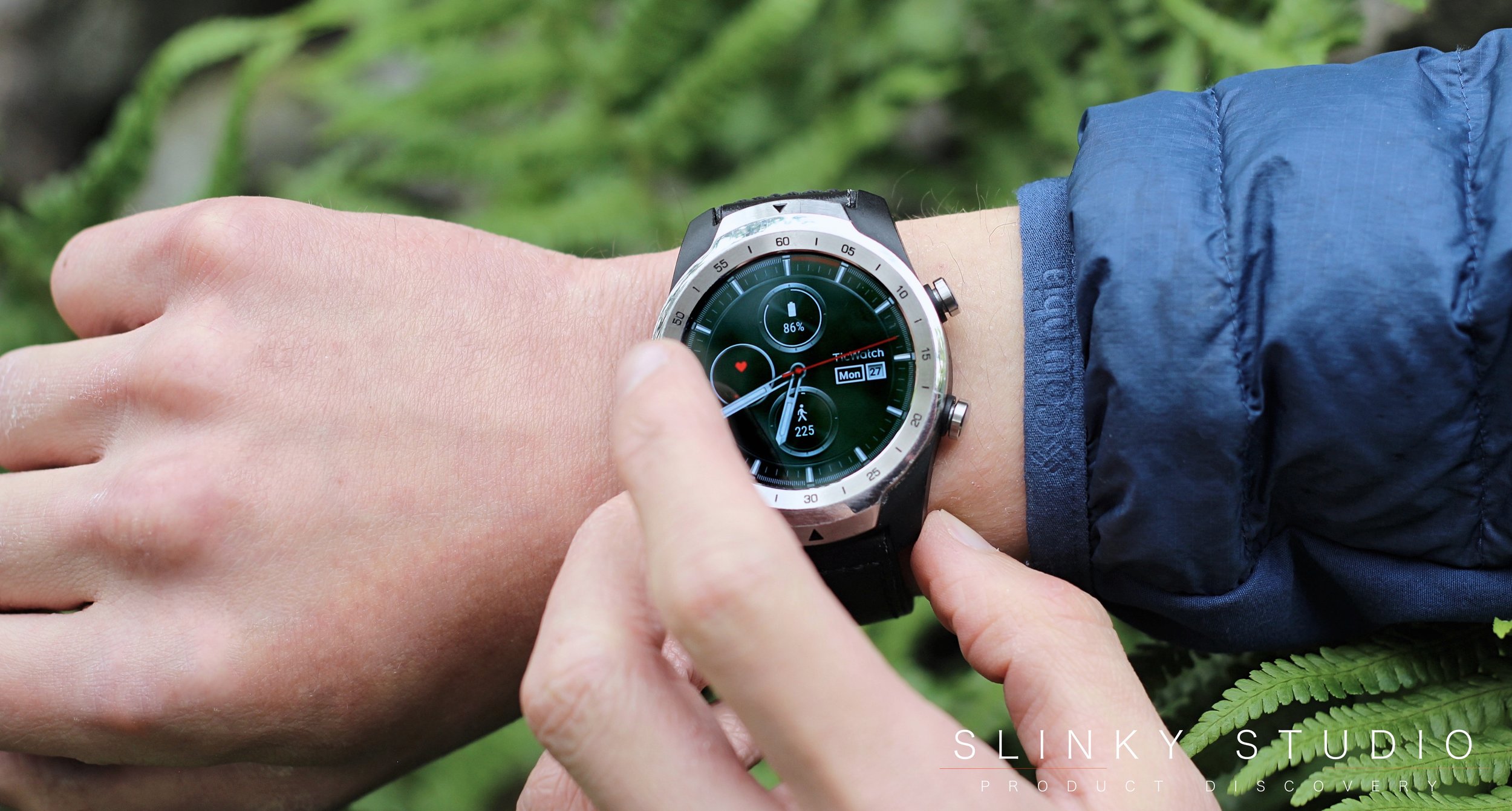
Staple features expected from smartphones and tablets are all here too; like notifications, raise to wake, Apps, a voice assistant - and it’s good at telling the time as well! The Google Play Store hosts a whole plethora of these widgets and watch faces, albeit if you want to have your heart rate, step count and total number of calories burnt present on the face there’s far slimmer choices available. We’re sure there are many more undiscovered gems that lay beyond those we use with frequency such as Google Maps, Facebook Messenger, Spotify, news apps, weather and Google Translate. And thanks to inbuilt NFC Google Pay deserves a special mention; it’s quick to access from a top swipe and carries James Bond style charm in action, plus amazing convenience with sub £30 payments, although such hardware as TicWatch Pro is still complementary to your smartphone and that’s cemented by it being Wi-Fi only. When on the move it borrows the internet functions from the connected smartphone with the Wear App running. This does make accessing certain pieces of information more convenient and that’s the case with fitness/lifestyle Apps. However, it’s not a replacement for the smartphone and often these Google Wear Apps serve more as a window looking into the smartphone's abilities, so unfortunately many of these third party scaled down mobile Apps are one time wonders, with little thought put into design factors - and performance can be iffy too.
Notably though, Mobvoi have no trouble getting it right when it comes to their in-house developed suite of TicExercise Apps. With Fitness, Step Ranking, Heart Rate and Health all coming pre-installed, all fairly intuitive to use, broad in the scope of usefulness and giving us the reassurance that the GPS and step count accuracy from the Pro can be relied upon. But the real USP of this suite is that each App utilises the low energy AMOLED display of the TicWatch Pro, to exhibit details of activity when you’re not actually physically interacting with the display, and so is perfectly sufficient for ‘at a glance’ style feedback. In contrast, Google’s suite of fitness Apps are exclusive to the OLED display and so to be able to keep a constant eye on stats they’ll eat over 50% of the battery doing a 4-5hr cycle.
Verdict
The TicWatch Pro is sincere in its modernist inner design, featuring a heart rate sensor, GPS & NFC; and that outward classical styled charm that exudes an assured posture surrounding the joy to behold OLED display. All this working together to fuse, rather favourably, a richer user experience from a maturing Wear OS. Importantly it tags along and into the digital lifestyle from a smartphone; although it can be independently minded - albeit with Wi-Fi access. There are definitely improvements and more that can be done with performance, and we'll be looking out for software updates to deal with this. Buy on Amazon


